Rethinking Uber: A User-Centric Critique of a Feature-Oriented Ecosystem
Travel, Food

Rethinking Uber: A User-Centric Critique of a Feature-Oriented Ecosystem
Exploring how a growing ecosystem affects user experience, and how alternate approaches could offer better scalability for users.
Project Overview
This critique explores the evolution of Uber’s app ecosystem, identifying fragmentation issues caused by a feature-oriented structure. It proposes a user-centered alternative, focused on simplifying navigation, reducing app sprawl, and leveraging contextual experiences across services.
Problem Statement
Uber has grown from a car-sharing app to an expansive platform offering food delivery, freight, and even grocery services. While this modular expansion supports business scalability and internal team structures, it results in fragmented experiences for users. Multiple apps, inconsistent navigation patterns, and overlapping services increase cognitive load and reduce usability.
Industry
Travel, Food
My Role
Senior Product Designer
Platforms
Web and Mobile
Timeline
May 2022
Outcome
Unified experience reduced app-switching and created a stronger sense of flow between services.
Map-based interaction led to faster access to relevant features, increasing task success rate and satisfaction.
Context-aware UI surfaced appropriate services at the right time, reducing friction and cognitive load.
Persona

Aisha Bellam
Freelance Photographer
A tech-savvy urban user juggling multiple services: rides, food, and package delivery through Uber’s ecosystem.
Age: 34
Location: Montreal, Canada
Tech Proficiency: High – uses mobile apps daily
Gender: Female
Goal
Get around the city quickly without toggling between apps.
Order food or deliver a package from the same familiar interface.
Rely on location-based shortcuts and history to speed up common actions.
Frustrations
Navigating across multiple apps for different services.
Difficulty locating places that aren’t easily searchable by address.
Confusion around product boundaries (e.g., ordering Uber to move furniture vs. Uber Freight).
Process
[01] User Research
Studied app store reviews highlighting navigation confusion and fragmentation across Uber apps.
Tested onboarding experiences across Uber apps to compare consistency and mental model alignment.
[02] Insights
Users view Uber as one service, not several. They expect a unified experience.
Contextual relevance is missing; the app doesn’t adapt based on time, location, or intent.
Memory-based tasks (e.g., “grandma’s house” or “work”) are difficult without saved or visual map options.
[03] Design Solution
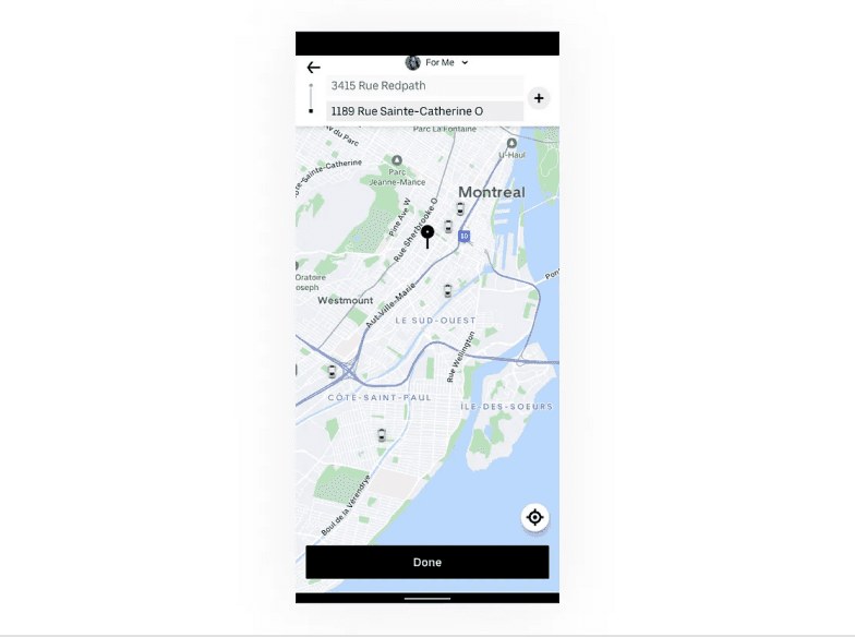
Introduce a clickable map-first interface that adapts to context and location highlighting relevant services like food delivery during dinner hours.
Offer role-based modes (e.g., Consumer, Driver, Merchant) within a single app using smart onboarding and permissions to filter views, rather than building separate apps.
Enhance destination memory with smart history, named locations, and visual pins for places like "Grandma’s house" or “My favorite falafel spot”.
[04] Testing & Iteration
Explored prototypes showing contextual overlays on the map and validated interest via user preference tests.


Key Learnings
Scalability Needs to Serve Users Too
Just because a system scales well for teams and services doesn’t mean it scales well for people.
Maps Can Drive Interaction
Putting the map front and center surfaces contextual needs and mirrors real-world behavior.
Feature Growth Requires Experience Architecture
Adding services shouldn’t mean adding apps, it should mean adding relevance.