600+ Redesigned Icons for a Cohesive Design System
Software Development

600+ Redesigned Icons for a Cohesive Design System
Unifying iconography across products to boost clarity, consistency, and collaboration at Informatica
Project Overview
Informatica’s legacy icon library was inconsistent in both form and style mixing colour and monochrome icons, square and rounded styles, and varying dimensions. I led a full redesign of over 600 icons to unify visual language, improve user recognition, and simplify implementation for cross-functional teams.
Problem Statement
The icon system lacked visual consistency, resulting in user confusion, poor recognition, and difficulty maintaining brand coherence across multiple products and teams.
Industry
Software Development
My Role
Senior Visual Designer
Platforms
Web
Timeline
November 2023 - February 2024
Outcome
Improved user clarity and reduced icon-related errors across multiple products.
Faster implementation through tagged, searchable icon components and export-ready assets.
Enabled better cross-team consistency and visual coherence across the entire product suite.
Persona

Leah Lee
Product Designer
A product designer managing UI consistency across several Informatica product interfaces.
Age: 32
Location: San Francisco
Tech Proficiency: High – proficient in Figma
Gender: Female
Goal
Ensure a consistent visual language across all interfaces.
Quickly find and implement relevant icons.
Avoid confusion among users due to inconsistent icon styles.
Frustrations
Inconsistent icon sizes and styles across products.
Difficulty maintaining and updating the icon library efficiently.
Users misinterpreting icons due to unclear visuals.
Process
[01] User Research
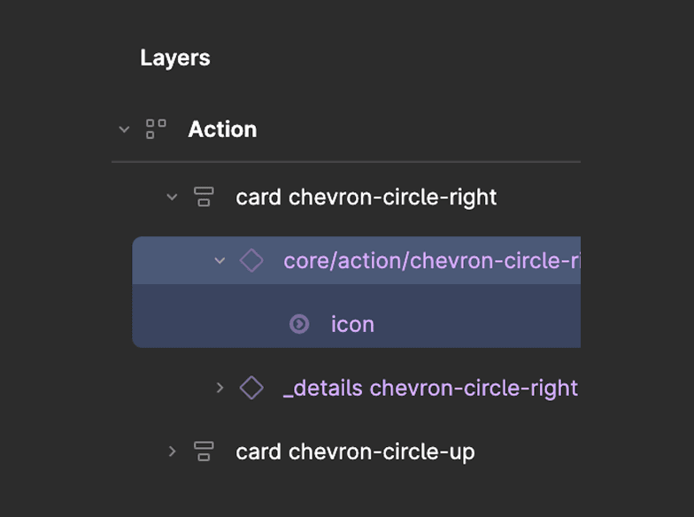
Audited over 600 icons used across various products to identify style inconsistencies and usability issues.
[02] Insights
A single design language improves icon recognition and reduces cognitive load for users.
Designers needed a more scalable, collaborative way to manage and update icons.
Tooltips enhance accessibility for complex or ambiguous icons.
[03] Design Solution
Standardized icon dimensions using an 18x18px icon on a 20x20px canvas with uniform padding.
Redesigned and updated all icons using a single colour and consistent visual language with subtle rounded details.
Integrated descriptive tooltips on hover for added clarity and accessibility.
[04] Testing & Iteration
Shared icon updates across teams in phases to gather UI feedback and ensure recognizability.
Refined padding, shape balance, and visual weight after usability testing and stakeholder reviews.
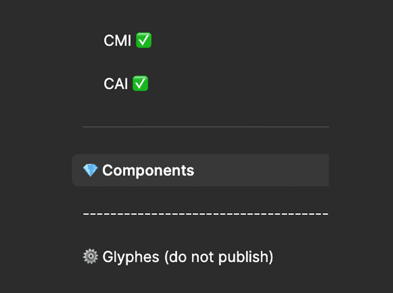
Iterated the Figma component page and export workflow based on team collaboration feedback.

Key Learnings
Consistency Drives Confidence
A consistent icon style builds user trust and improves interaction flow.
Design Systems Empower Teams
Centralized icon management empowers designers and developers to work faster and more accurately
Micro-details Make a Macro Impact
Even a 2px corner radius or 1px padding choice impacts scalability and user recognition