
Uber app critique
A new alternative to the existing Uber eco-system.
One of the most heard word in the UX field is “assumptions”.
When coming with an idea that can solve a problem, we try to avoid those assumptions with data, testing, etc.
Several ideas can solve the same problem but only one or two are tested to verify those assumptions.
So how ideas are selected?
Most of them are chosen from the people capacity at a time given, the budget, sometimes the long term vision.
Another trendy word is “Agile” and can be interpreted in different ways. It is more time consuming to go from a step to another and can imply re-doing a lot of things such as, design, architecture, code, etc.

The Uber Case
Uber has been founded in 2009. In the first years, the focus was into the car sharing solution, transporting people. Then, we saw the emergence of Uber Eats, Uber freight, even Uber “groceries” through Uber Eat.
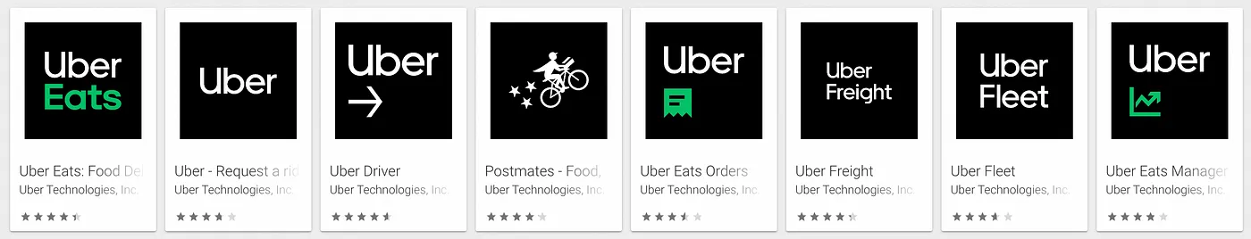
How many apps part of this eco-system could we have? The answer would be probably:
“As much as we have services.”
The path chosen here is clearly what I call “features oriented”. This pattern is mostly seen in IT because it allows different teams working on different projects, maybe collaborating but not at a point to break another team’s product. Collaboration can get extreme when you reach 29300 employees quickly (2021).
It seems to be the best solution from a product management perspective. From the user perspective, it is probably not the best solution (assumption).
What is the problem?
Let’s get back to the initial problem.
All those apps are initially serving a same goal:
Connecting point A with point B.
We distinguish 3 different categories of users:
- People who order
- People who drive and deliver
- People/businesses that can sell or manage (Restaurants, stores, etc)
We could have one app doing everything and depending on privileges or account, we get the consumer experience or the business owner experience. Clearly, it becomes messy with different navigations, different goals. It makes sense to have their own environment.
For the driver, if transporting people get slow on an early evening, they can jump on delivering food.
For the consumer, there are different types of app such as the Regular Uber, Uber Eats, Uber Freight. The last app is funny because I have personally seen people ordering a regular Uber to move furnitures, it is confusing.
In the future, will we have Uber groceries, Uber Mail Express, Uber Health?
It is scalable and maintainable for the business, it is not scalable for users.
The Regular Uber app is changing and you can now order Uber Eat, groceries, package on it, the home page is an entire menu that redirects to those different products.
Have you ever known a place without knowing the adresse? Your grandma’s house for example or a nice greek restaurant you went last week with your buddy but don’t remember the name or perhaps your work.
This pin option has a very low emphasis being the last option in a typing screen.

Alternatives
Bringing some interactions by making the map clickable from the beginning, and showing what needs to be shown depending on the location:

